


Account Functionality V2
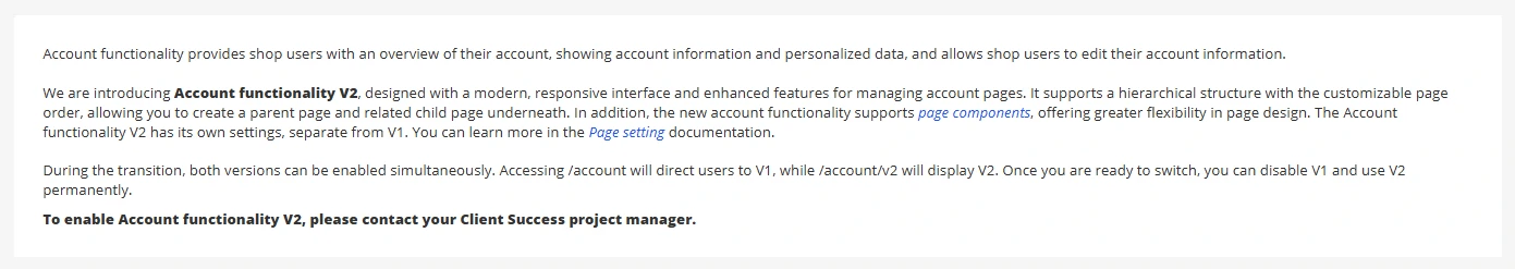
Account functionality provides shop users with an overview of their account, showing account information and personalized data, and allows shop users to edit their account information.
We are introducing Account functionality V2, designed with a modern, responsive interface and enhanced features for managing account pages. It supports a hierarchical structure with the customizable page order, allowing you to create a parent page and related child page underneath. In addition, the new account functionality supports page components, offering greater flexibility in page design. The Account functionality V2 has its own settings, separate from V1. You can learn more in the Page setting documentation.
During the transition, both versions can be enabled simultaneously. Accessing /account will direct users to V1, while /account/v2 will display V2. Once you are ready to switch, you can disable V1 and use V2 permanently.
To enable Account functionality V2, please contact your Client Success project manager.
Account Functionality V2 elements
1. Header includes company logo and "Back to shop" button.
The "Back to shop" button is set up with Translation keys:
- Ac-BackToShop for desktop and tablet devices.
- Ac-Back for mobile device.
2. Menu displays all active Account functionality V2 pages. The display order relies on the page order arranged in Admin site. The display name is page title, while page icon is page's image. Learn more about Page setting.
Note: A logout button is set up with a Translation key "Ac-Logout".
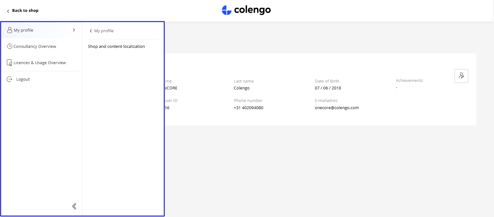
3. Content panel displays all the page components that make up the current page. Top of the page will display a page title and breadcrumb underneath.
Component set-up guideline
oneCORE provides a set of fundamental components available to all clients, while also allowing flexibility to create custom components for specific needs. Below, you’ll find a list of available components along with setup guidelines.
Page layout that support page component is "Default" layout.

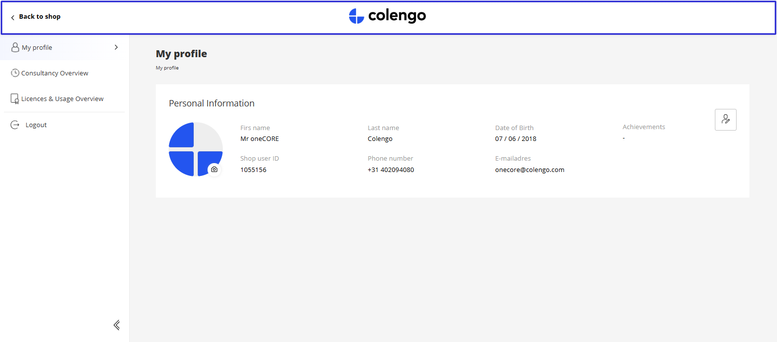
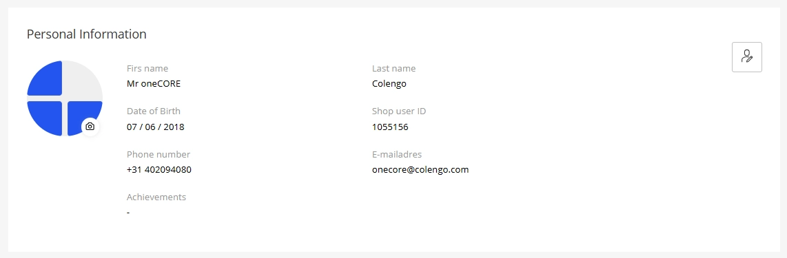
AccountOverview
This component displays customer's personal information and allows customers to edit their information.
Every elements are set up with Translation keys below:
- Ac-PersonalInformation
- Ac-FirstName
- Ac-LastName
- Ac-ShopUserId
- Ac-Achievement
- Ac-PhoneNumber
- Ac-EmailAddress
- Ac-Salutation
- Ac-Mr
- Ac-Mrs
- Ac-Unset
- Ac-Save
- Ac-BirthDay
- Ac-Clear
- Ac-Apply
- Ac-InvalidFileSize
- Ac-InvalidFileType
- Ac-LastNameRequiredMessage
- Ac-FirstNameRequiredMessage
- Ac-EmailRequiredMessagez
- Ac-TelephoneRequiredMessage
- Ac-BirthdayRequiredMessage
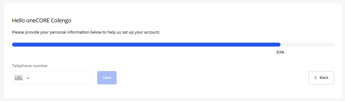
AccountCompletion
This component encourages customers to fill out their personal information.
You will need to set up a component with a dynamic form type "Account Information Question". Fields added to the form will be used to calculate for the account data's completion.
Title and description are editable via component editor. Other elements are set up with Translation keys below.
- Ac-FillInformationCompleted
- Ac-Back
- Ac-Next
- Ac-Salutation
- Ac-Mr
- Ac-Mrs
- Ac-Email
- Ac-FirstName
- Ac-LastName
- Ac-TelephoneNumber
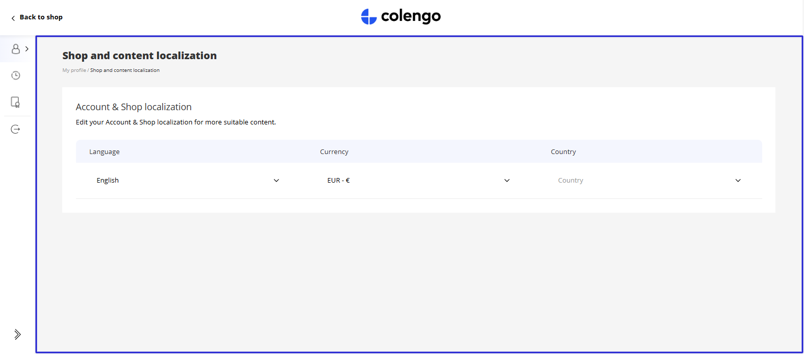
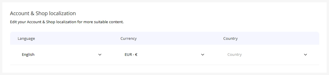
AccountPreference
This component allows customers to customize their account and shop localization (compared to a setting page of Account V1).
Title and description are editable via component editor. Other elements are set up with Translation keys below:
- Ac-Country
- Ac-SearchCountry
- Ac-Language
- Ac-SearchLanguage
- Ac-Currency
- Ac-SearchCurrency
Content
This component is designed for dynamically displaying information based on your usage.
The content can be set up in a rich text editor, supporting headings (H1–H6), hyperlinks, and formatted text for flexible content creation.
Note: There are pre-defined text colors as follows:
- H1 - H3 = Solid black (#000000)
- H4 = #333333
- H5 = #5C5C5C
- H6 = #999999
- Hyperlink = Primary color from company setting
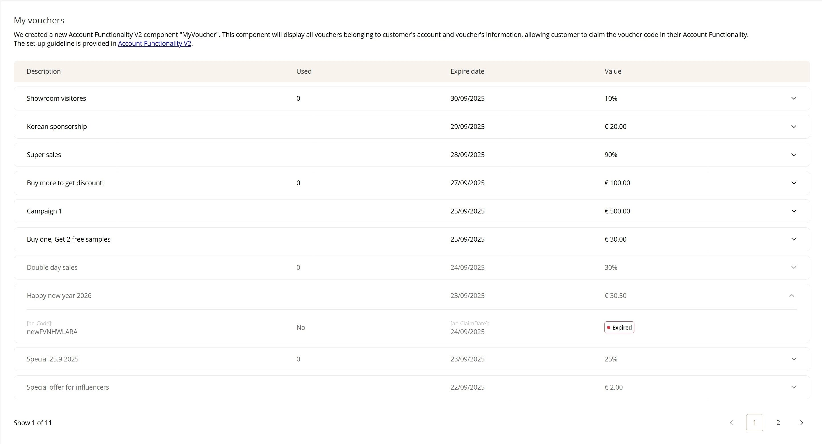
MyVouchers
This component will display all vouchers belonging to customer's account and voucher's information, allowing customer to claim the voucher code in their Account Functionality.
The voucher list is sorted by campaign expiry date, from upcoming to expired. After, customers claim their vouchers, the code will appear.
Title and description are editable via component editor. Other elements are set up with Translation keys below:
- ac-Description
- ac-Used
- ac-ExpireDate
- ac-Value
- ac-Code
- ac-Yes
- ac-No
- ac-ClaimDate
- ac-Claimed
- ac-Expired
- ac-Claim
- ac-EmptyVoucher (when account has no voucher assigned)