oneCORE has developed a page component editor, a feature to help you construct your page with individual page components and edit content of each page component. In this article, we will introduce you all functions and how to use a component editor.
Page component editor
Elements on component editor
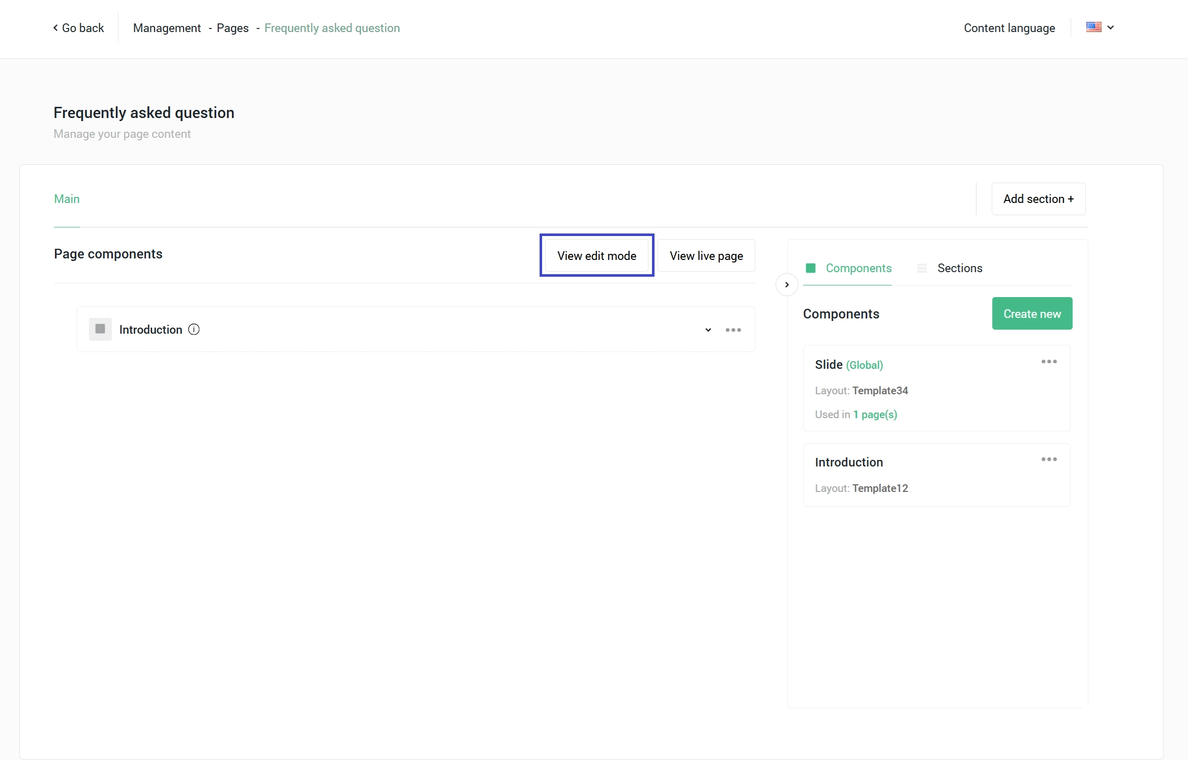
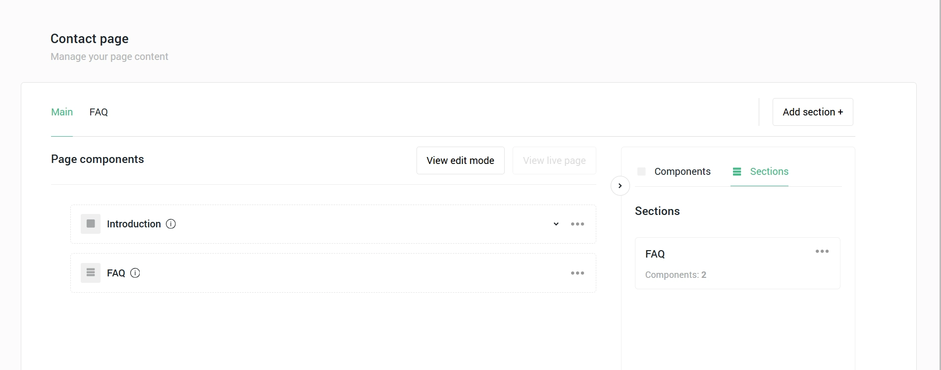
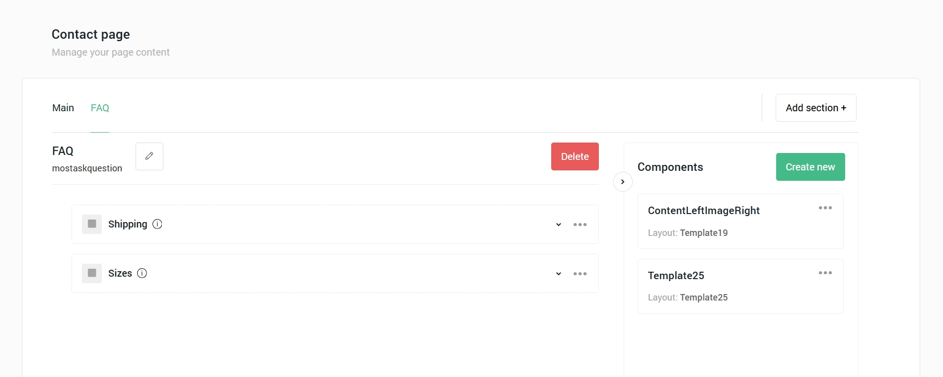
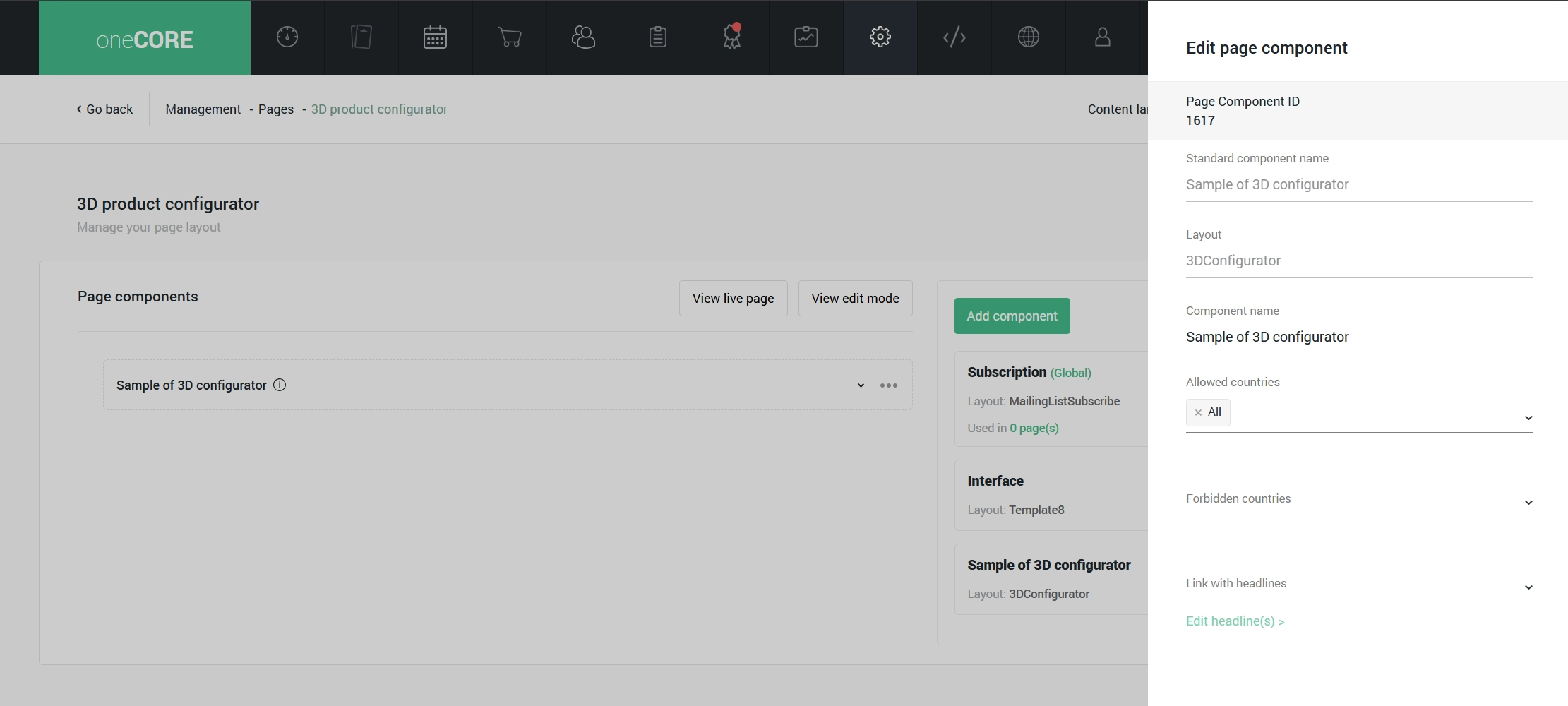
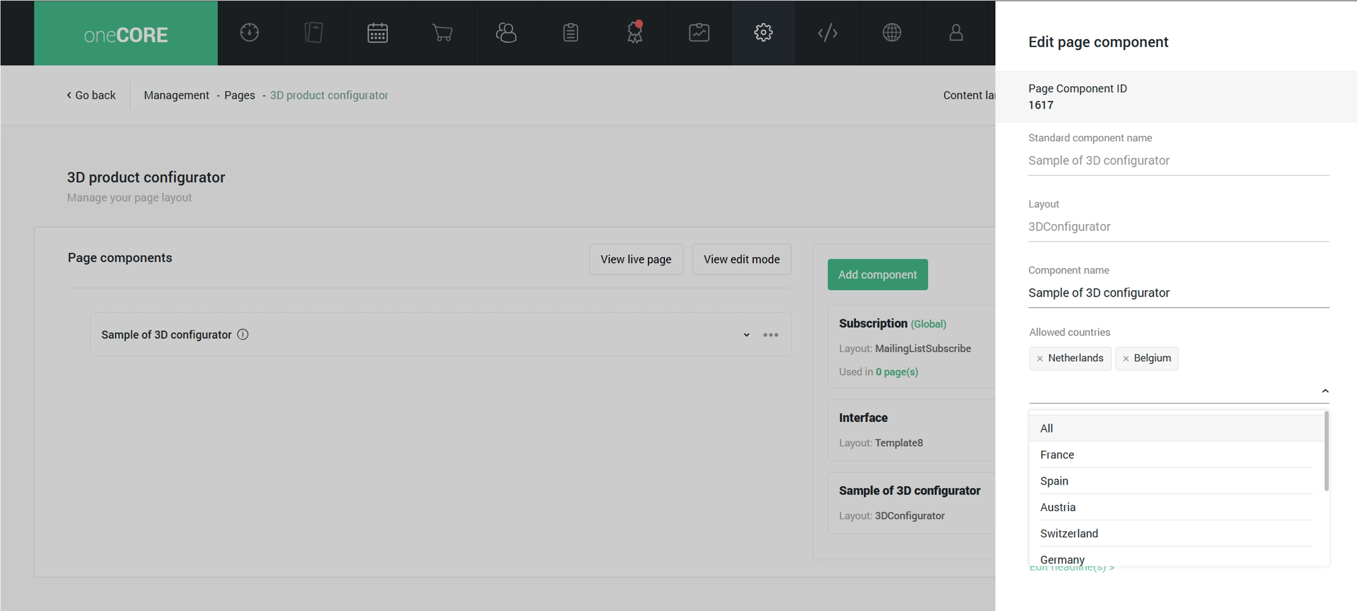
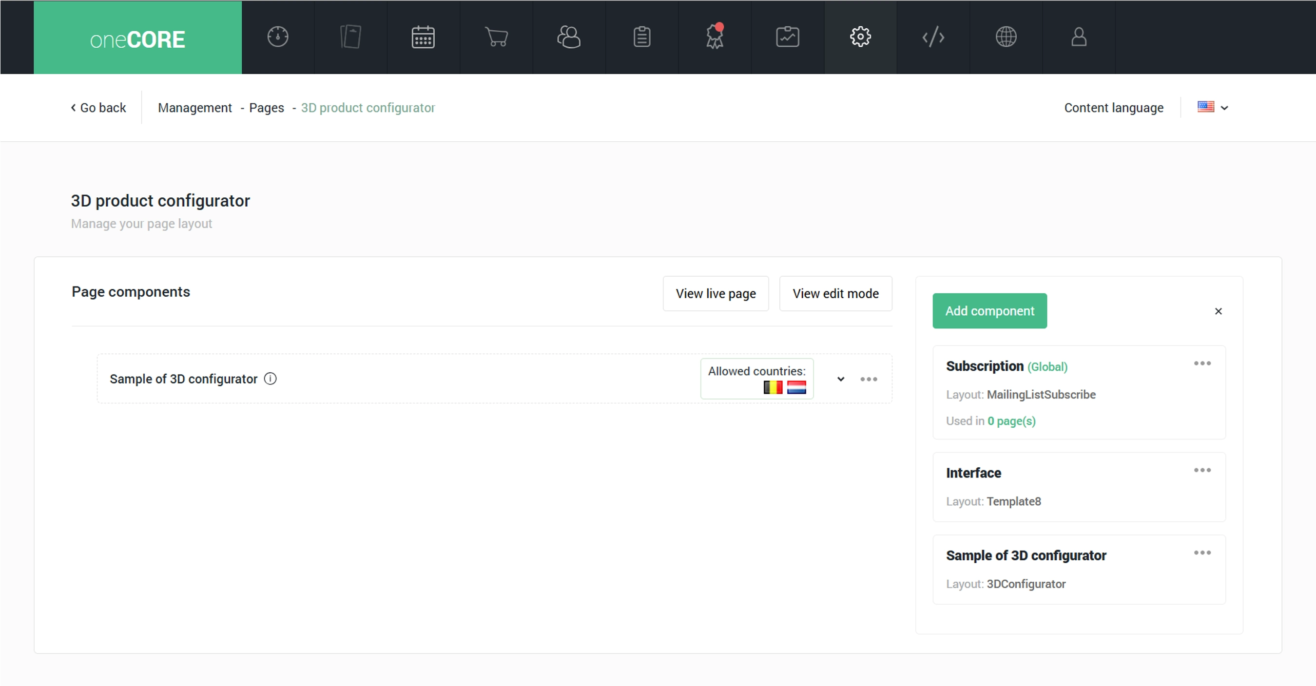
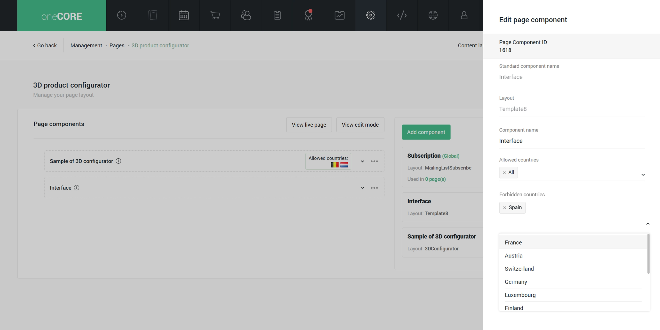
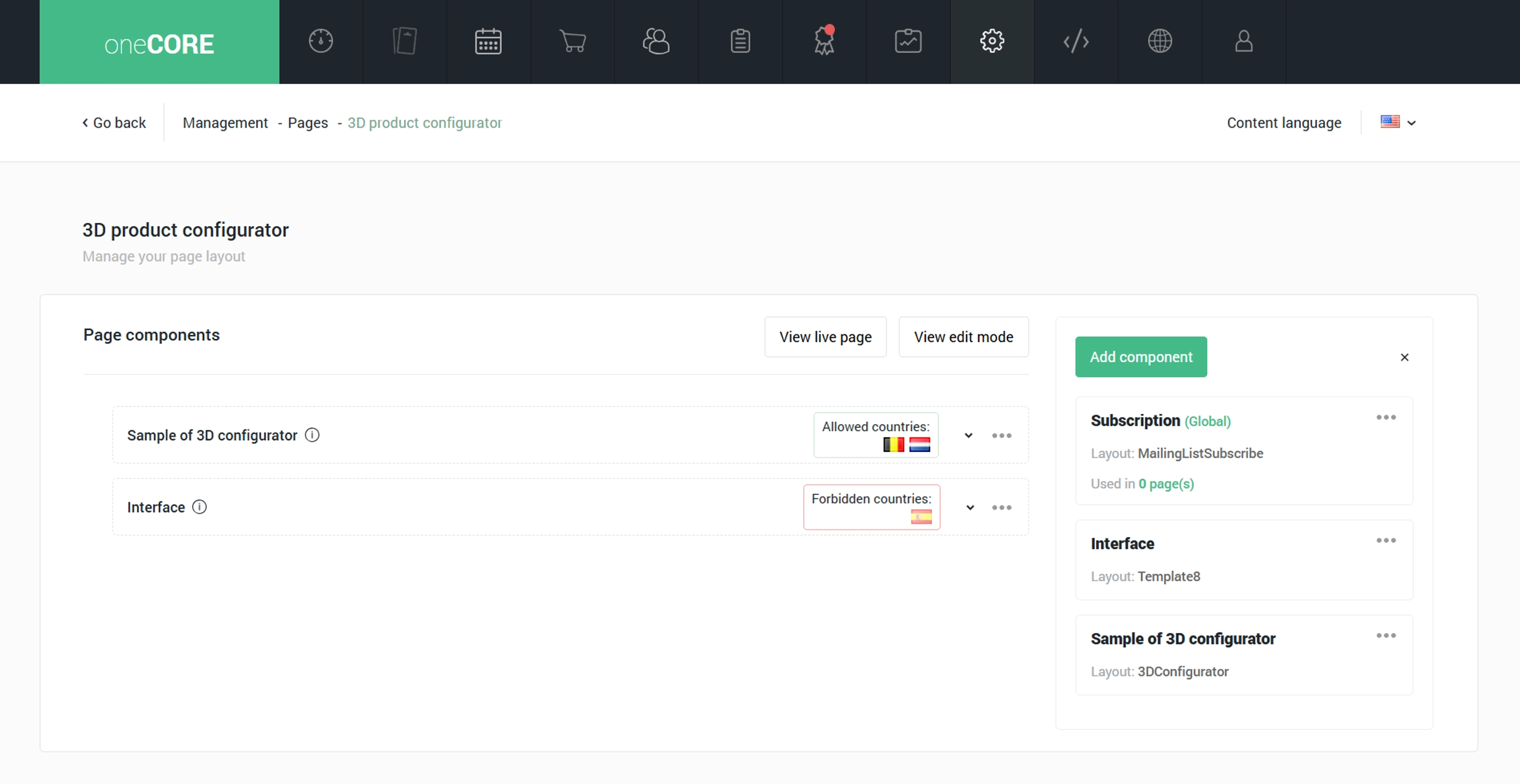
1. Page component panel displays all the page components that make up the current page. Users can add a component to a page by dragging the component to this panel. Users can manage the page components – add name, assign countries for content localization and modify content – within this panel.
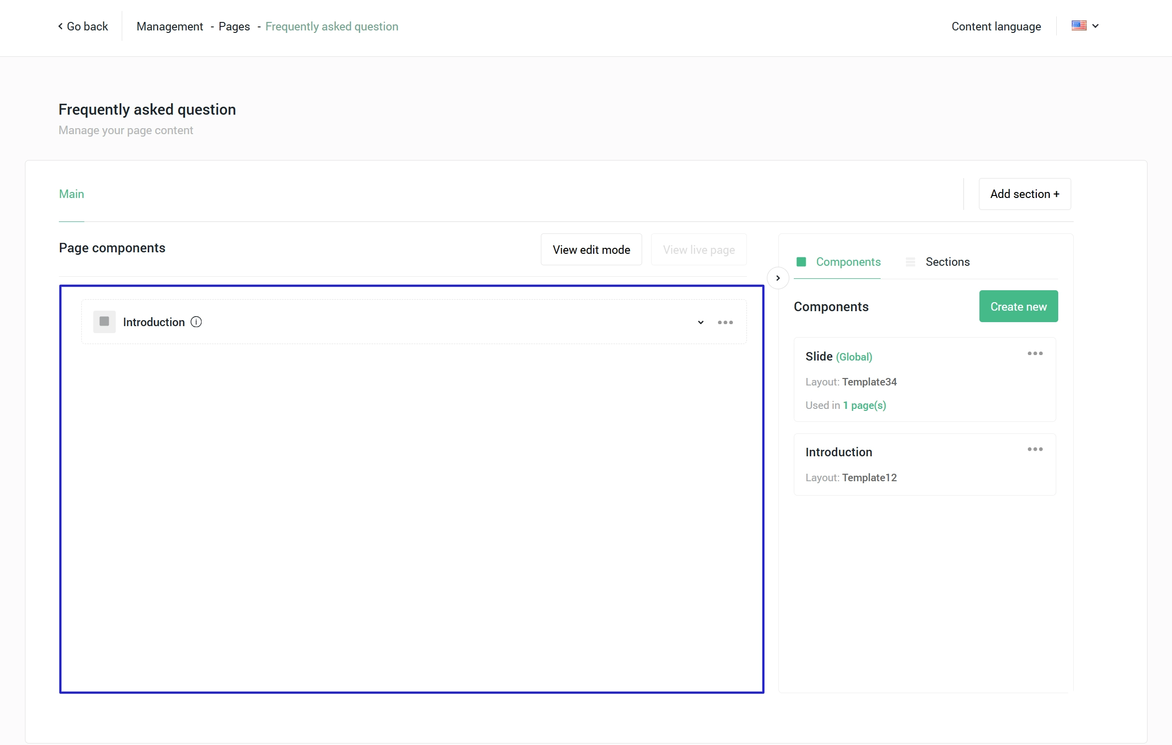
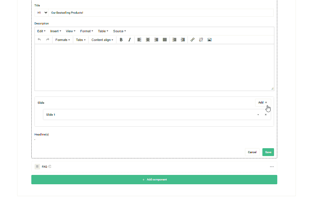
2. Component panel displays all components created on this page. Users create a component by
- add a component name
- select a layout
- select a component level:
- global – the global level is the master component. If you edit one, it will be applied to all. Additionally, the global component will be available to use on all pages.
- specific – the specific level is the single component which can be used only on a specific page you add it to. If you edit one, it won’t be applied to another component.
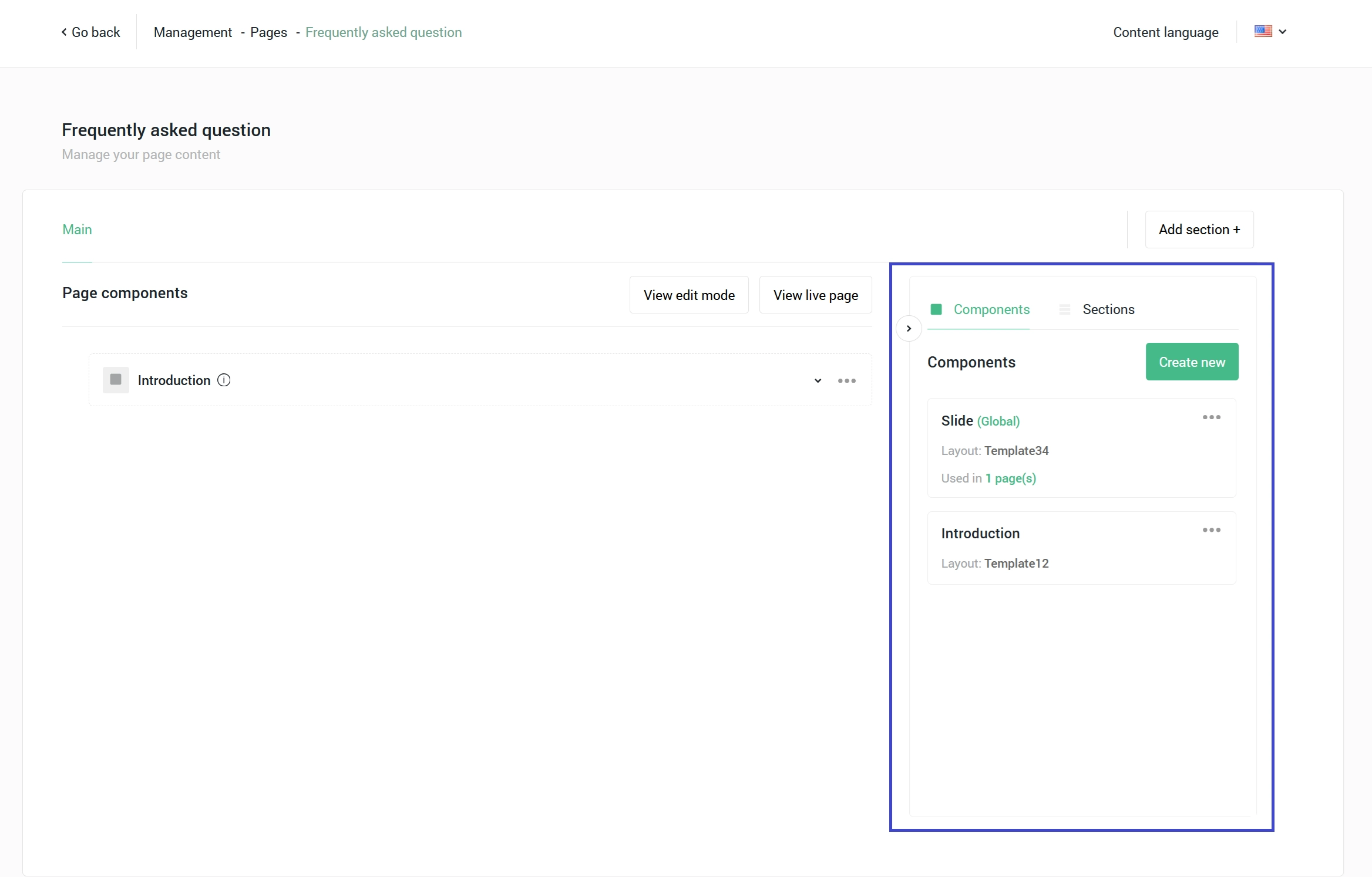
3. View live page opens a live page on your website.
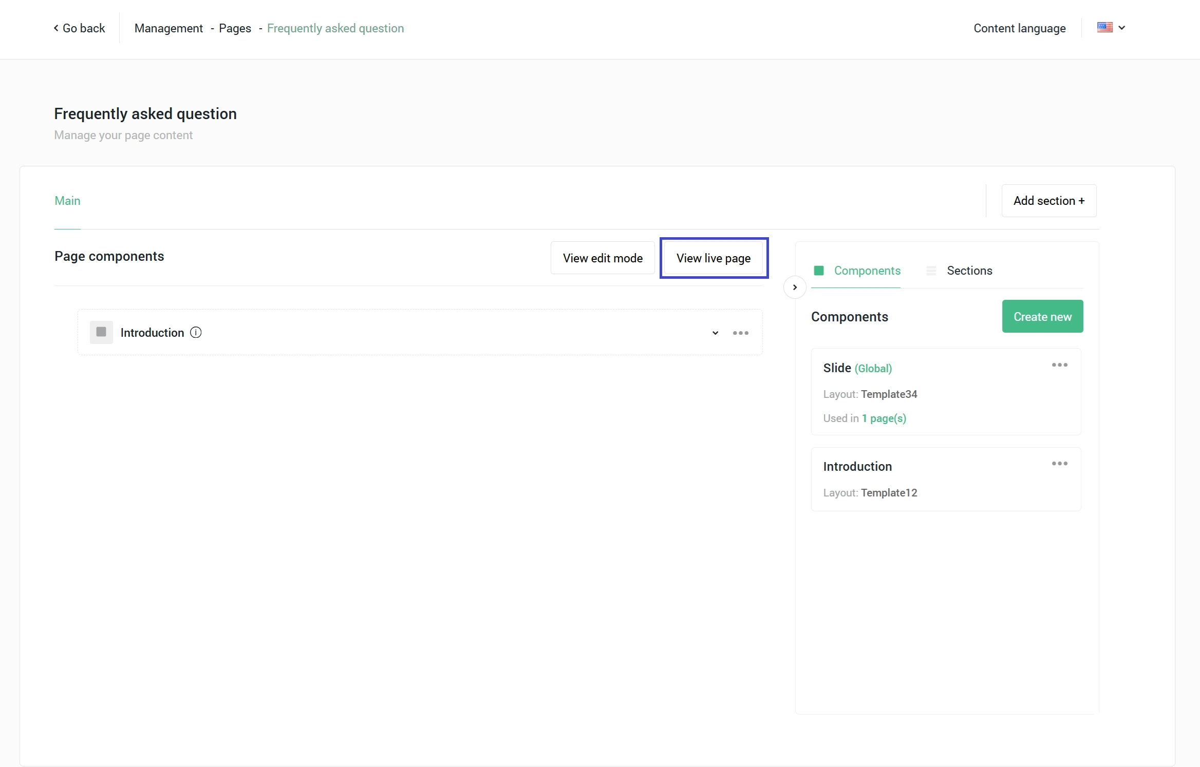
4. View edit mode opens a preview page. A preview page displays every heading tag on a page and allows users to see the preview page for each language and country in case that page contains country-specific page components.
Forbidden and allowed countries
oneCORE component editor supports content localization, enabling you to control page component visibility based on country. A page component will be visible for all countries by default; therefore, it automatically selects all countries in ‘Allowed countries.’ To restrict the visibility, you can specify countries in either of the following fields:
- ‘Allowed countries’ specifying that users of these countries can see this page component on a page
- ‘Forbidden countries’ specifying that users of these countries cannot see this page component on a page.
Note: the countries which users can specify in the page component are based on the company’s available countries.
Default selection is All in 'Allowed countries.'
Select countries in 'Allowed countries' to specify that users of these countries can see this page component on a page
Select countries in 'Forbidden countries’ to specify that users of these countries cannot see this page component on a page.
Collection
Collections within a component enable users to add an unlimited number of content groups. This functionality is ideal for creating dynamic elements, such as slideshows or flexible content blocks, where users have the ability to add unlimited content.
Pin custom text on component images
The tag function on component editor allows users to pin the custom text at designated location on image within a components or collections, in order that a shop can display the image with data at precise locations. To enable this function requires custom integration for each component.
Add a tag
1. Select an image you would like to pin a tag and click a tag icon to start.
2. Clicking at the icon will open a new window with your selected image. Click at the location you would like to pin a tag on.
4. After that, you can add the data of that tag. The tag's available fields in each component are specified during the development process.
5. Upon saving your tag, an icon will appear on the image, indicating the total number of tags applied.
Copy a tag
1. Select a tag you would like to copy and select copy to…
- Note: select multiple tags to copy them all at once.
2. Select target image(s) in a component you would like to copy this tag to.
3. Upon saving your tag, a tag will be created in the target image with the same location and data as the original tag.
A copied tag on another image is a newly created tag with the same data, therefore, editing the original won't change the copied ones. To update a tag on all images, the best practice is to delete the existing tags and create a new one.
Delete a tag
Select a tag you would like to delete and you will have 2 options for how you would like to delete the tag
1. Delete – to delete this tag from 1 image you are on.
2. Delete from all images – to delete this tag from all images in a component.
The system will identify the same tag across images in a component by location and data. If both locations and data of the tags match, the tags are considered identical and all will be deleted simultaneously.