


The screen resolutions that we support
We understand the importance of designing websites that are responsive and can be viewed on a variety of devices and screen sizes. One of the key aspects of creating a responsive website is ensuring that it can adapt to different screen resolutions. To achieve this, we are proud to offer support for a wide range of screen resolutions. Whether your customers are using a large desktop monitor or a small smartphone screen, they can access and browse your website without sacrificing functionality or user experience.

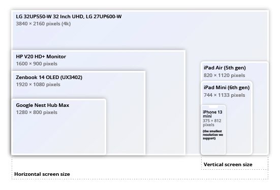
• Desktop screens are typically larger and offer a wider display area, so we have ensured that our website is optimized for larger screen resolutions from 1367px up to 1680px. This ensures that customers can view and navigate your website comfortably on their desktop screens.
• Tablets are also a popular device for browsing e-commerce websites. To cater to tablet users, we have optimized our website for screen resolutions of 768px – 1366px. This ensures that your website looks great and functions properly no matter what size tablet your customers use.
• Finally, mobile devices such as smartphones are becoming increasingly popular for browsing e-commerce websites. To cater to this trend, we have optimized our website for screen resolutions of 375px - 767px. This ensures that customers can easily view and navigate your website on their mobile devices, even with the smaller screen size.
In addition to offering support for a broad range of screen resolutions, we also understand the importance of thoroughly testing our website to ensure that it performs flawlessly on all devices. This is why we test our website on a variety of screen resolutions as follows:
• 1680px
• 1367px – 1679px
• 1025px – 1366px
• 768px – 1024px
• 481px – 767px
• 375px – 480px
By testing on these resolutions, we can identify and address any potential issues that may arise, such as text or images being cut off or elements not displaying correctly.
In conclusion, we are dedicated to providing exceptional user experiences for our clients. By supporting a broad range of screen resolutions and utilizing advanced responsive design techniques, we can guarantee that your website looks stunning and functions flawlessly on all devices, regardless of how customers choose to access the internet. Whether they are browsing on a powerful desktop computer, a convenient tablet, or a sleek smartphone, we are committed to providing them with an unparalleled user experience that is seamless and effortless. You can trust our team to create an e-commerce website that will not only meet your expectations but exceed them, driving more traffic, conversions, and sales for your business. With our support, you can provide your customers with an exceptional online shopping experience that is visually engaging, intuitive, and easy to navigate. Contact us today to learn more about how we can help you achieve your e-commerce goals!